Have you ever used a website or app that felt just right? As if everything were in its proper place? This is the psychology of UX, as it makes a website or application feel natural to use.
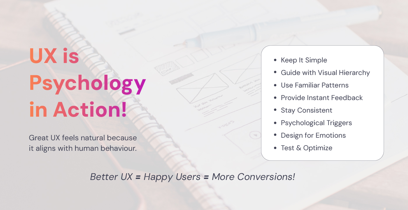
Designers create excellent UX (User Experience) for more than just aesthetic reasons. It’s about comprehending how individuals act, think, and decide. Designing with psychology in mind makes consumers feel at ease, involved and more inclined to act.
So, how can one use psychology in design? Let’s talk about a few basic ideas that make UX genuinely effective.
What Psychological Principles Should UX Designers Follow?
Users don’t always behave logically. In fact, most of the time, they take shortcuts, rely on habits and make snap judgments. That’s why understanding their psychology is so important.
Here’s a checklist to help you design an experience that feels right.
1- Keep It Simple (Cognitive Load Matters)
Too many choices, text and buttons can overwhelm the users. The brain prefers simplicity. If you overload users with too many features, they often give up instead of taking action.
Your goal should be to reduce cognitive load and make every interaction effortless. As a designer, you need to keep these things in mind:
- Use clear, concise language. Cut the fluff. No jargon. Instead of “Leverage our innovative AI-driven solution,” just say “Use AI to simplify your work.”
- Reduce choices. The fewer decisions, the better. Have you noticed how Apple only gives you three iPhone models to choose from? That’s intentional as it prevents choice paralysis.
- Prioritize what matters. Every page should have one primary action users should take. Don’t distract them with unnecessary options.
Think about Google’s homepage. Just a search bar. No distractions. It is a perfect example of simplicity that keeps users focused.
2- Guide Users with Visual Hierarchy
When you land on a website, do you read every single word? No. You scan. Your eyes jump to the biggest, boldest text or the most visually striking element. That’s because our brains look for patterns to quickly understand a page.
- Big, bold fonts = “Look at me!” Use larger text for headlines and key messages so users immediately know what’s important.
- Position matters. Users tend to scan from left to right and top to bottom. That’s why important buttons should be high on the page and towards the left (or center).
- Color and contrast. Bright, high-contrast colors grab attention but use them wisely. If everything stands out, nothing stands out.
- Instagram’s heart icon for likes? It’s big, easy to tap, and turns red when active, guiding users to interact without thinking. That’s a visual hierarchy in action.
3- Use Familiar Patterns (Don’t Make Users Think)
Users don’t like surprises when it comes to navigation. They expect certain things to be in certain places:
- A logo should take them back to the homepage.
- A cart icon means shopping.
- A search bar belongs at the top.
Imagine if Twitter suddenly put the ‘like’ button at the bottom of a tweet instead of the side. Confusing, right? Stick to what users already know.
4- The Power of Instant Feedback
People like to know their actions worked. Whether it’s clicking a button or filling out a form, feedback reassures users.
- Buttons should change color when clicked. It tells users, “Yes, you pressed this.”
- Forms should show a success message after submission. A simple “Your message has been sent!” removes any doubt.
- Loading indicators reduce frustration. If a process takes time, show a spinner, progress bar or animation so users know something is happening.
Facebook’s reaction emojis pop up instantly when you hover over the like button. That’s satisfying feedback in real time.
5- Build Trust with Consistency
Trust is everything in UX. If your design changes too much from page to page, users feel lost. Keep things consistent by following these rules:
- Fonts, colors, and buttons should look the same everywhere. Imagine Airbnb suddenly using a different font on its booking page. Wouldn’t that feel off?
- Navigation menus should always be in the same place. Users shouldn’t have to search for the search bar every time.
- The tone of voice should match across all content. A professional banking website shouldn’t suddenly start using casual slang.
Airbnb nails this. Whether you are on their app or website, everything feels the same. That builds trust.
6- Nudge Users with the Right Psychology Triggers
Want users to take action? Use these psychological triggers:
- Scarcity: “Only 3 left in stock!” This triggers FOMO (Fear of Missing Out).
- Urgency: “Sale ends in 2 hours.” Users feel pressure to act quickly.
- Social proof: “Join 10,000+ happy customers.” People trust what others trust.
Amazon does this perfectly with “Only 2 left!” messages. It makes you buy faster.
7- Keep Emotions in Mind
People might forget what your product does, but they won’t forget how it made them feel. A delightful experience creates loyal users. You can design for emotions by:
- Using friendly, conversational language.
- Adding fun micro-interactions
- Creating delightful surprises
Duolingo makes learning fun with a cheerful owl and encouraging messages. That’s emotional UX at work.
8- Test, Test and Test Again
Even the best UX designs fail if they don’t match real user behavior. That’s why testing is everything.
- A/B Testing: Compare two versions of a page to see which works better.
- User Testing: Watch real people interact with your design.
- Analytics: Track what users click, where they drop off, and what confuses them.
Netflix constantly tests its home screen layout to keep users engaged. That’s why you always find something to watch.
Designing UX That Just Feels Right
It all comes down to good UX which is all about understanding people. When you design with psychology in mind, users don’t just use your product; they enjoy it.
At Doerz Tech, we create digital experiences that feel natural and intuitive. Our team of UX experts understands human psychology and we can help you build designs that engage and convert.
Want to improve your UX? Book a complimentary 30-minute consultation with us today!
People Also Ask
1. What is the most important psychology principle in UX?
Simplicity is key in UX design. When something is easy to use, people naturally engage with it more. A clutter-free, intuitive interface keeps users coming back.
2. How does color psychology affect UX design?
Colors trigger emotions. For example, blue builds trust (Facebook, LinkedIn) while red creates urgency (YouTube, Netflix). Choosing the right colors can influence user actions and brand perception.
3. What is Hick’s Law in UX design?
Hick’s Law states that more choices lead to longer decision times. That’s why clean, simple menus help users go through the application or website faster. Reducing options makes decision-making easier and improves user flow.
4. How do I make my website more user-friendly?
A user-friendly website has clear navigation, fast load times and easy-to-read fonts. Keeping things simple and clutter-free improves the experience. Prioritizing simplicity and usability leads to a better user experience.
5. Why do users abandon websites?
Users abandon websites due to slow loading speeds, confusing layouts and excessive pop-ups. A smooth and hassle-free experience keeps them engaged. A fast, clear, and hassle-free experience keeps them engaged and coming back.


